Yes, I am aware that the words 'inverse' and 'inverted' are used very frequently in this blog, but I don't really mind. I like the words.
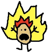
I am also aware that the flame on the peanut in the logo of this blog is inverted. The red part is on the inside and the yellow is on the outside. No flame would ever look like this, but trust me when I say it looks better this way. It also helps to show people that I'm not your average person. I do things opposite of the norm.
For example: I talk about flaming peanuts.
So. I expect not to get any complaints about how my drawing is weird and the flame is outside in. It looks good, so I am leaving it like that.
P.S. I swear the peanut looked at me like that.
Tuesday, 18 September 2007
Subscribe to:
Post Comments (Atom)


No comments:
Post a Comment